We failed to predict rental prices, here's what we learned.
What the data tells you about your business.

With Microsoft I get to travel to interesting places and events around the world - and I get to work with companies to solve whatever they think accelerates their business the most. This time, we invited several companies to work with assigned Microsoft software engineers over several days focussing on two things:
- Improving their skills on machine learning
- Trying to solve the problem(s) - or explain what the difficulties are
If that sounds strange to you, I encourage you to go read my other post about my work at CSE. If not, you are in for a great journey into rental pricing.
Enter the land of housing
At this particular event, I had the opportunity to learn and work with a customer that has a history in renting out entire business parks! For the week, the goal was simple: each property has several assets (e.g. office floors) that are rented out on a yearly basis (or longer) and they wanted to be able to price them more accurately.
In order to predict these lease prices, they brought several years worth of contract data (amounting to about 10 000 rows for one business park) from their operation. We now had to pick features to fit the contracts better to the actual value of these offices.
Luckily their head of business development and one of his team members, a very talented business intelligence analyst joined me to bring in some expertise on what the columns actually mean. Additionally both did not know a lot about machine learning, so it was a great opportunity to learn!
Planning I
Since this data was already nicely structured and is quite time sensitive (GDP development, currency, …), we decided to follow the CNTK tutorial on predicting stock prices to start off. In short, the model predicts whether the price for a renewal will be higher or lower. As an added bonus it’s a fairly simple classification model to build and it comes with a tutorial so it was easy to reproduce for the learners 😊.
The steps to getting there were:
- Sanitize, split, and encode the data
- Align the data as a time series on a property level
- Train a model
- Check the business impact
- Profit!
The Azure Machine Learning workbench, was about to become our very handy tool to inspect, dice and slice the data.
Data prep
The hard part is usually getting the data into a usable format and maybe finding features in the available dataset. In this case, the data was pretty much prepared for immediate use! After filtering out some outliers (free rentals, very large/expensive assets, etc.) the data was almost ready.
This filtering and dropping rows also significantly reduced the number of rows to work with, in the end we had ten properties, each with about 350 rows of lease data available. As an alternative option we also started using the data regardless of the property it’s on (giving us close to 4 000 rows).
Picking features
As far as business rentals go, pricing seems to work a little differently (at least in that country) than regular flats. The available features included:
- Price per square foot
- Asset area (in square foot)
- Floors above ground
- Floors below ground (parking garages)
- Start and end date of a lease
- “Default” price per square foot
- Service charges
- Grace period between leases
- Macro economic data per day
Depending on the type of model, we would evaluate their impact and try to find the best configuration.
Up/Down Classification
The model is built as a neural network with only a few inputs, two dense hidden layers, and a two-class output. Using CNTK, the code is nice and short:
input_dim = len(feature_names)
num_output_classes = 2
num_hidden_layers = 2
hidden_layers_dim = len(feature_names)
input_dynamic_axes = [C.Axis.default_batch_axis()]

input = C.input_variable(input_dim, dynamic_axes=input_dynamic_axes)
label = C.input_variable(num_output_classes, dynamic_axes=input_dynamic_axes)

def create_model(input, num_output_classes):
    h = input
    with C.layers.default_options(init = C.glorot_uniform()):
        for i in range(num_hidden_layers):
            h = C.layers.Dense(hidden_layers_dim, activation = C.relu)(h)
        r = C.layers.Dense(num_output_classes, activation = None)(h) # we'll apply softmax afterwards
    return r
Assuming the lease prices are behaving like a time series (akin to the stock market), this classifier uses previous changes (increase or decrease) and the current price difference to predict whether the next lease is going to be higher or lower priced. By default these events (up or down) should have a probability of 50% each and by getting a reliably higher chance for one, the valuation can change accordingly. Of course the increase over 50% (called “edge”) has to be significant to have predictive power (let’s say >10% in our case, since the data is sparse!).
While this entire premise is quite naive, it’s easy to understand and reproduce with the CNTK tutorial on predicting stock prices.
Lease prices as time series
Just like the stock market, leases have prices associated with dates, which puts a price tag on an asset at that time. If these prices are put in a series per asset, this series indicates the price development per asset. Obviously the duration between two data points can vary and any other influences (e.g. damages) are ignored as well. However the model is able to spot trends, which would be enough to make more informed decisions.
Ultimately the number of features was quite low, only the changes of three leases (using one-hot encoding; 1 means it went up from the lease before) in the past and the price difference:
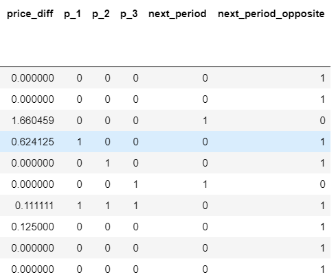
Complexity vs data
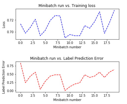
In short: this did not work. Up/down classification is expected to yield accuracies around the 50% mark, yet for the classifier to find a causal correlation it has to be in the data as well. This becomes quite apparent when plotting training and test loss (it’s supposed to go down 😅):
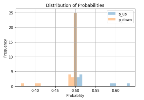
Turns out that if the classifier said “it’s going down”, it was right most of the time. In fact, around 70% of the leases seem to have gone down compared to their preceeding leases and the histogram shows that most of the time the decision is basically random:
This figure alone tells much of the story:
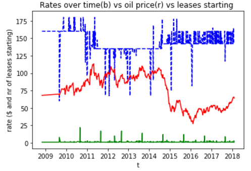
(blue: lease prices, red: oil prices, green: number of leases starting)
Observing the blue line it’s quite clear that the overall trend of these prices is to be lower than before, which means that the classifier will probably not take the right decisions. Additionally the spikiness of what would otherwise be a flat blue line, shows that essentially there is always a standard price with many execptions - so it does not have trends but fluctuations between plateaus. In reality this model will falsely spot a trend whenever one of those spikes occur!
Furthermore the red (a huge factor for economic growth in the area) and green lines (the volume of starting leases) don’t correlate at all with the others. Clearly the model cannot work for predicting/adjusing lease prices. Yet it taught us a lot about the data and the overall situation. Maybe a different approach would help?
A different approach is needed
To explore the data further and maybe shed some light on its usefulness, the next step was to create and fit a linear model to the prices. This model predicts output prices instead of classes and therefore determines the “worth” of a lease based on the input data.
After several tries these features turned out to predict the prices best:
- Floors above ground
- Duration of a lease
- Lease start year
- Area in square feet
- “Default” price per square foot
- Service charges
- Grace period between leases
Regression model
Using scikit-learn, we created a simple Linear Regression model to fit to the data:
# imported from scikit-learn
linreg = linear_model.LinearRegression()

# Train the model using the training sets
linreg.fit(X_train, y_train)

y_pred = linreg.predict(X_test)

# check test accuracy & model precision
rms.append(math.sqrt(mean_squared_error(y_test, y_pred)))
r2.append(linreg.score(X_test,y_test))
Our strategy generated five models to choose from and in order to get a glimpse on how well they did predicting the test values, a scatter plot is produced for each of them:
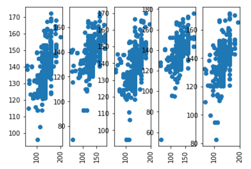
This shows predicted vs actual values and ideally they should be a nice diagonal line. The cloud in these pictures only told us that the error rate is fairly high.
Statistical proof
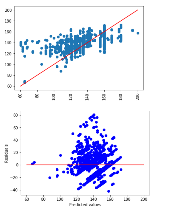
With more numbers it’s quite easy to verify those first thoughts. Five models were trained and can be evaluated by using the r² coefficient to indicate how good the predictions were:
# in the same order as above, higher is better: 1 is a perfect match, 0 a 100% miss
[0.3824938914649103, 0.31158204578420867, 0.3361892227498475, 0.3070800581600319, 0.35385015146616405]
The same can be replicated visually, with the red line being the best possible outcome and the scatter cloud representing predicted vs actual values:
Learnings
Failures are the best opportunities to learn, and especially with customers and users on site it’s a great discussion to have and insights to be shared (especially since they spent time and effort in coming to Microsoft’s event). Looking at the different outcomes we could tell them:
- They need to collect more specific data. while general, contract-related data is fine for keeping track of what’s going on, it’s not enough for evaluating price causality. Personally I think data about the asset and their tenants would be very helpful (e.g. revenue if it’s a public company, number of bathrooms, infrastructure, other companies).
- The strongest correlation was between their “default rate” and the actual lease price, which caused a linear model to simply say “140” and be right around 70% of the time. A more complex model could remedy that, but would it be closer to reality?
- With three major pillars towering in the middle of the histogram it is clear that the “default rate” is either encouraged or human psychology is at work here (anchoring effect). Either way, by adjusting this “default rate” (e.g. make it dynamic based on the market rates) would provide more useful information to their salesforce.
- Machine learning and statistics is a useful tool under the belt of a business intelligence analyst and the person working with us immediately started Andrew Ng’s course. I hope that she sticks with it and becomes a great data scientist!
All of this shows a simple truth: data science can only provide what the data already “shows”. A lot of the actual correlations might be too complex for humans, but often it’s not complex enough to find radically new things. Since our data looked like this:
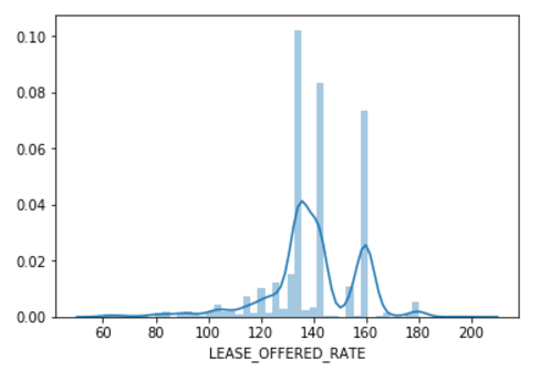
… humans may have had a good shot at predicting the price too 😊. This was also what the customer took away: their default prices need more adjustments and by basing them off the local real estate market they could have a significant influence on their rental contracts.
Thanks for reading, if you like this sort of thing let me know on twitter: @0x5ff and share this post.